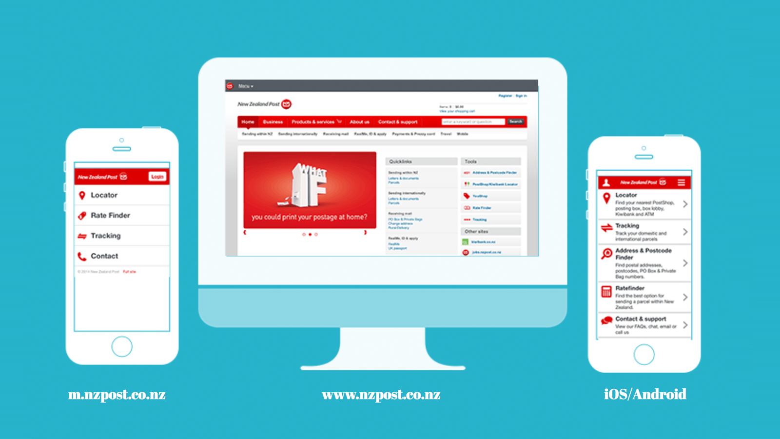
nzpost.co.nz was in need redesign to better serve a growing number of devices and screen sizes that customers were accessing the site with. Initially I was tasked with redesigning the homepage and improving the experience in a meaningful way through better visual hierarchy and delivering appropriate content.
nzpost.co.nz responsive redesign New Zealand Post
One of New Zealand's busiest sites and offers services to help New Zealand. Connecting people, businesses and communities together.
Why redesign?
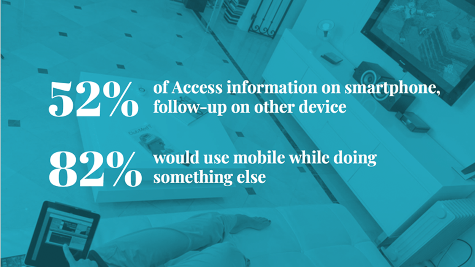
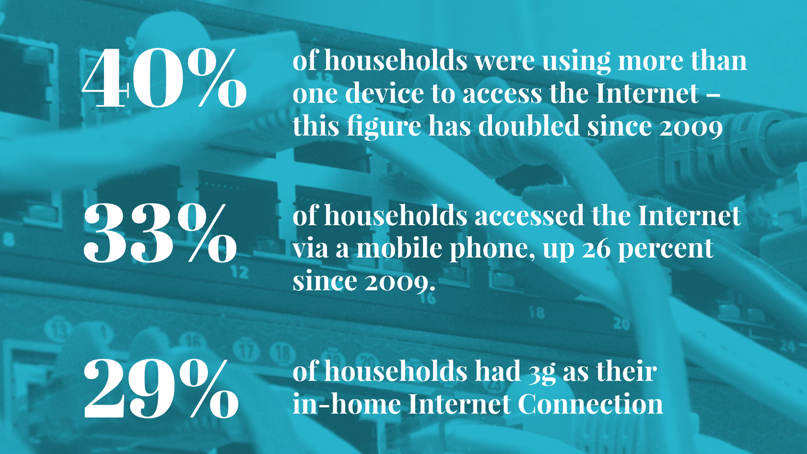
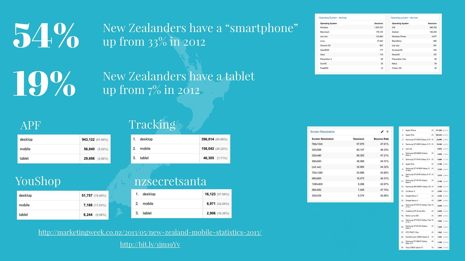
As a team the online channel, knew the site was in case of a redesign. The current site was not responsive, had lots of variations, and was not meeting the needs of our customers.
To get the wider business onboard with why we needed to redesign the site and why we needed to move to a responsive pattern driven design, I put together a presentation to explain some of the reasons and issues.
Aligning with the brand
Previous website redesigns had been done in isolations by agencies and had not even taken the time to align the various New Zealand Post brand collateral
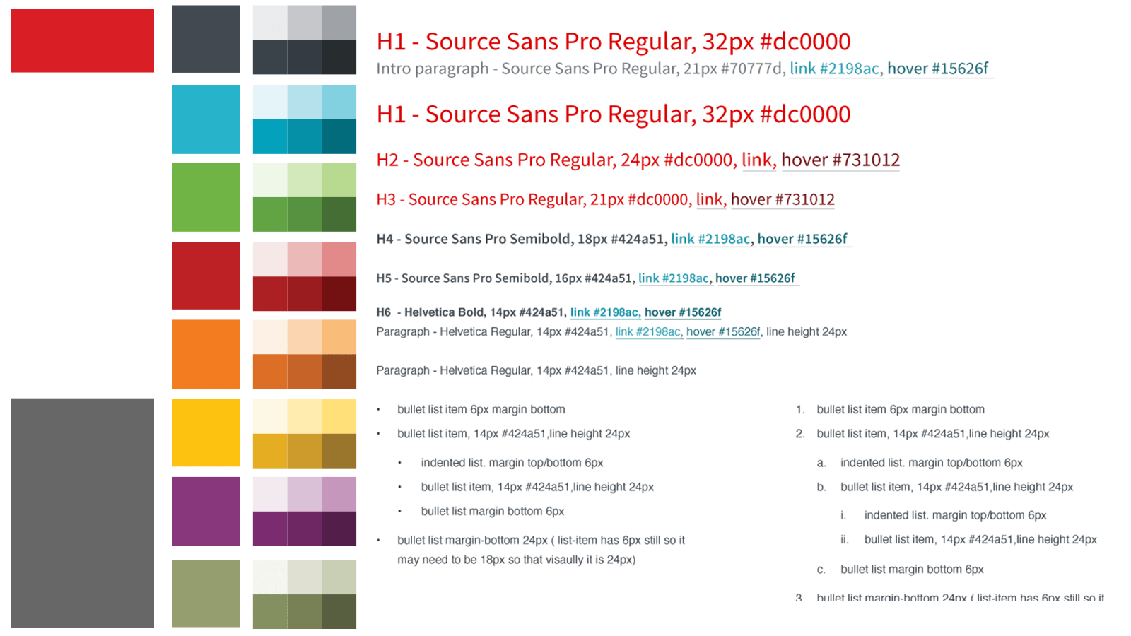
I worked with the brand team to create some visual rules for digital product and services. Rather than just duplicate the rules for print, we choose to use colours and typefaces that worked well in the digtial space but also kept the same look and feel as other brand material.
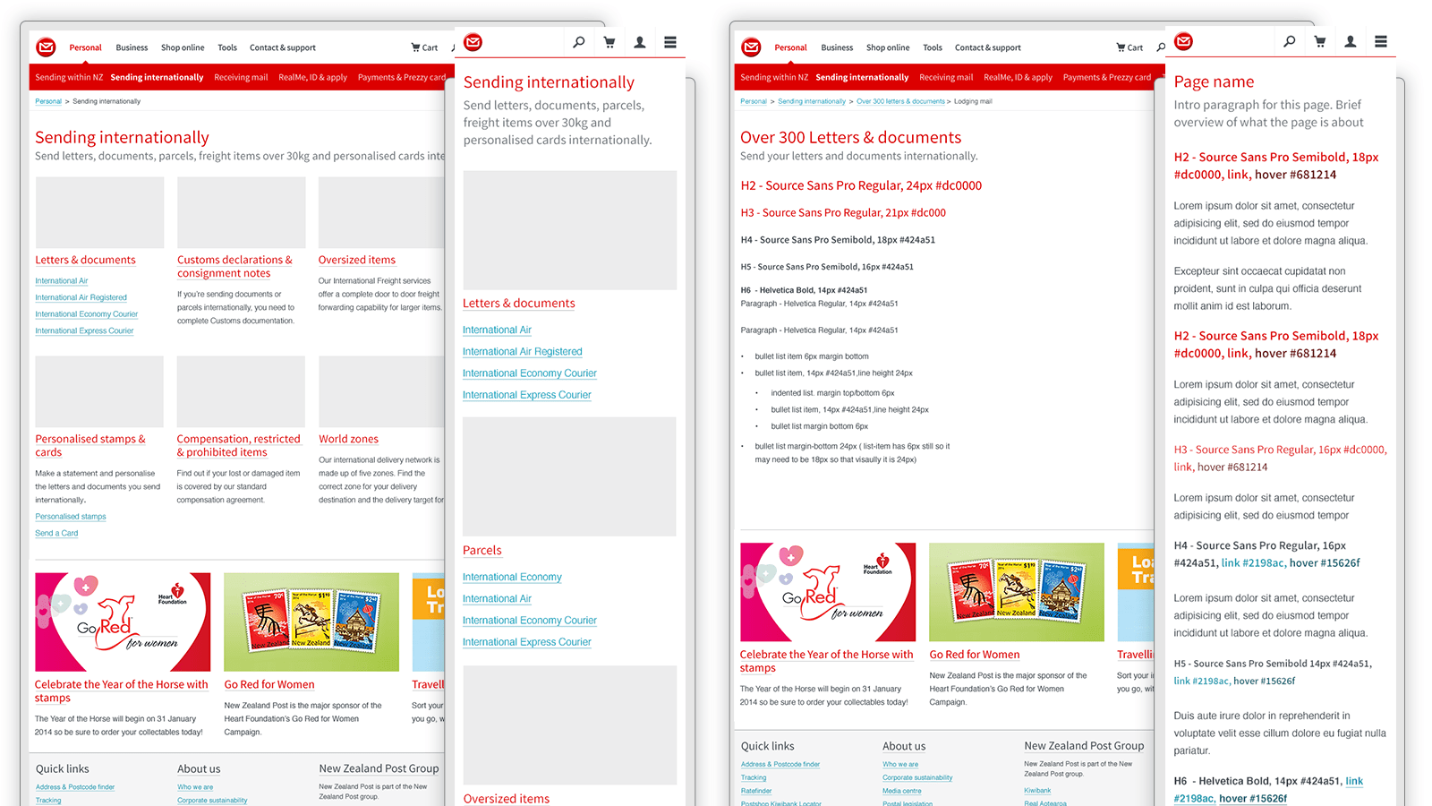
Pattern library
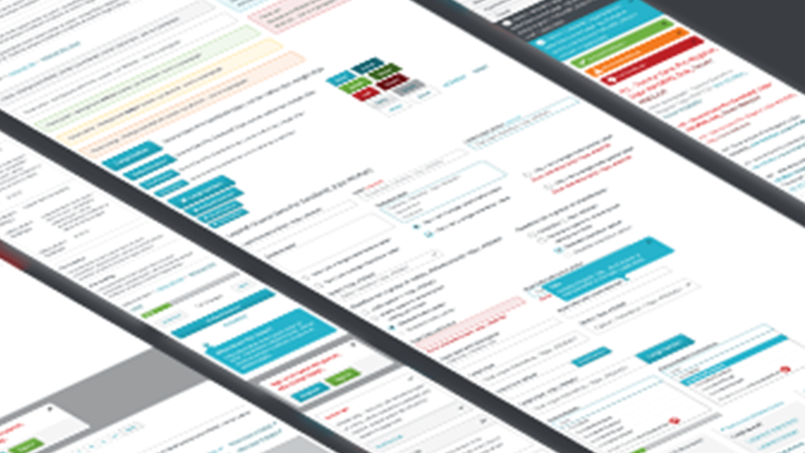
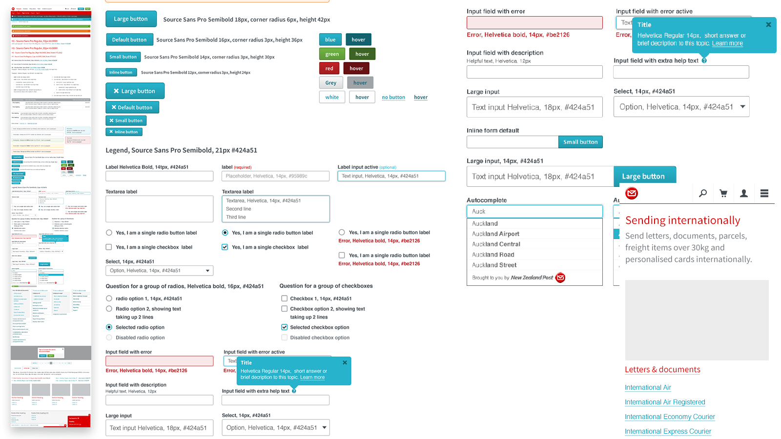
Having reviewed the current website and worked out all elements needed. I then started to design the UI for each element in a combination of photoshop and in html and css. ( SCSS modules ).
Designing a new homepage
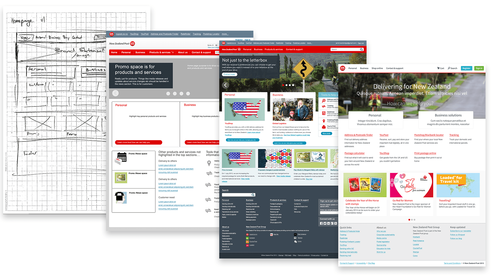
While we were pushing for components driven design. We also realised there was a need to bring people on board and get excited about the new site that was developing.
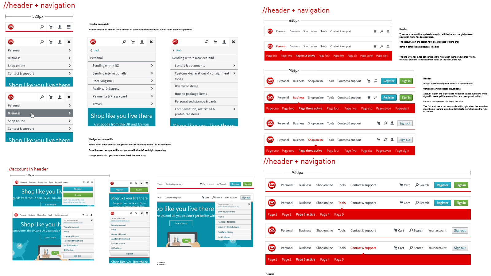
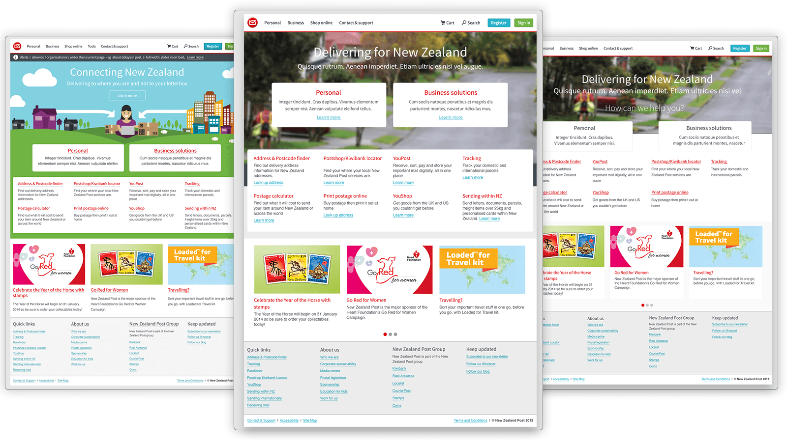
I worked on using the components that had been designed and put these concepts where people around the business could see them.
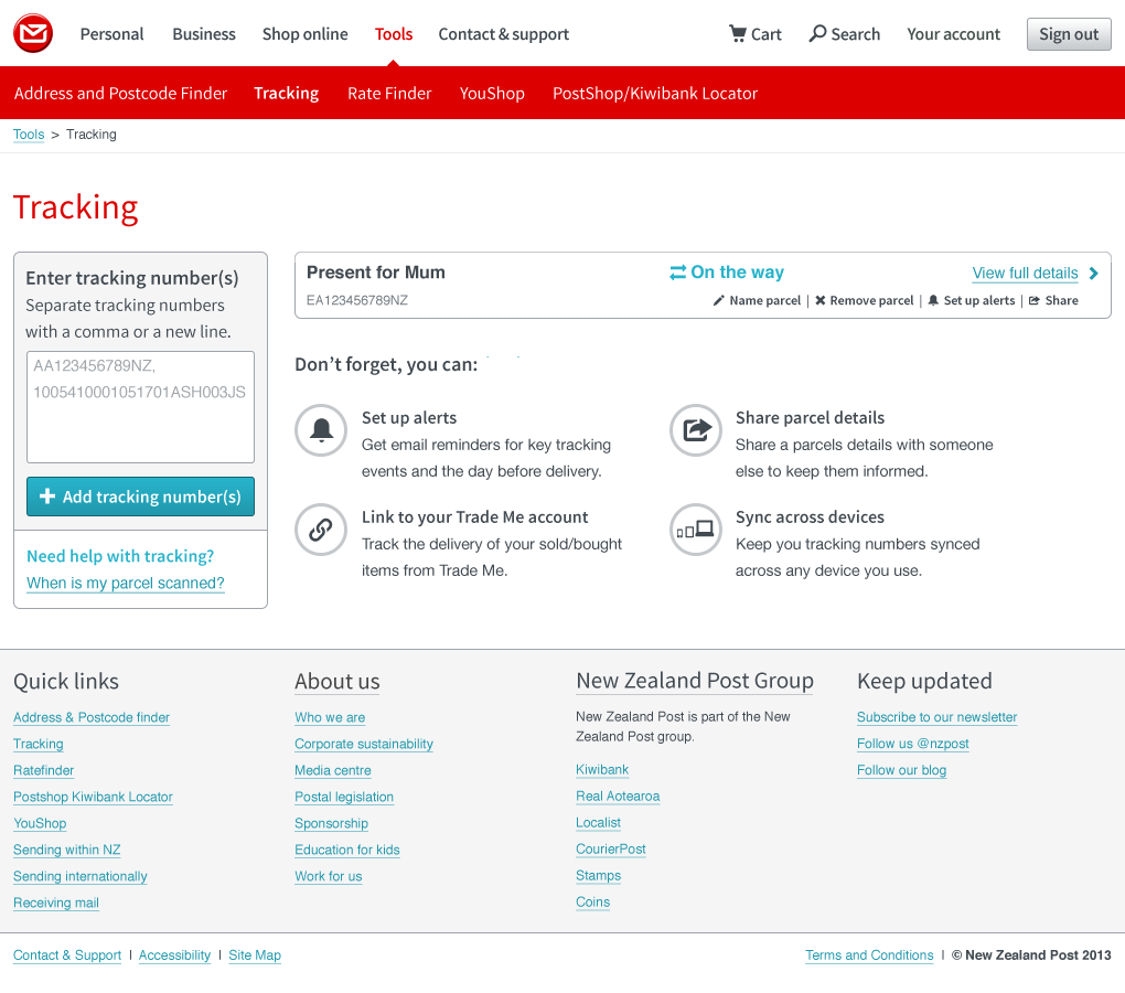
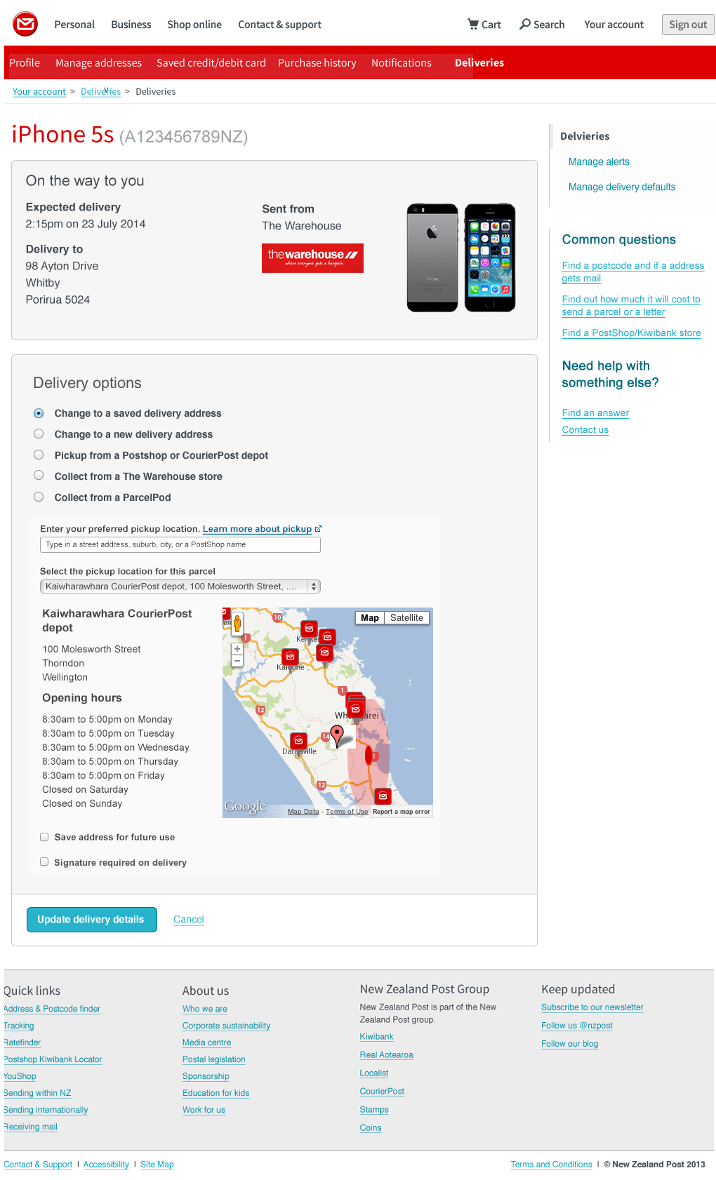
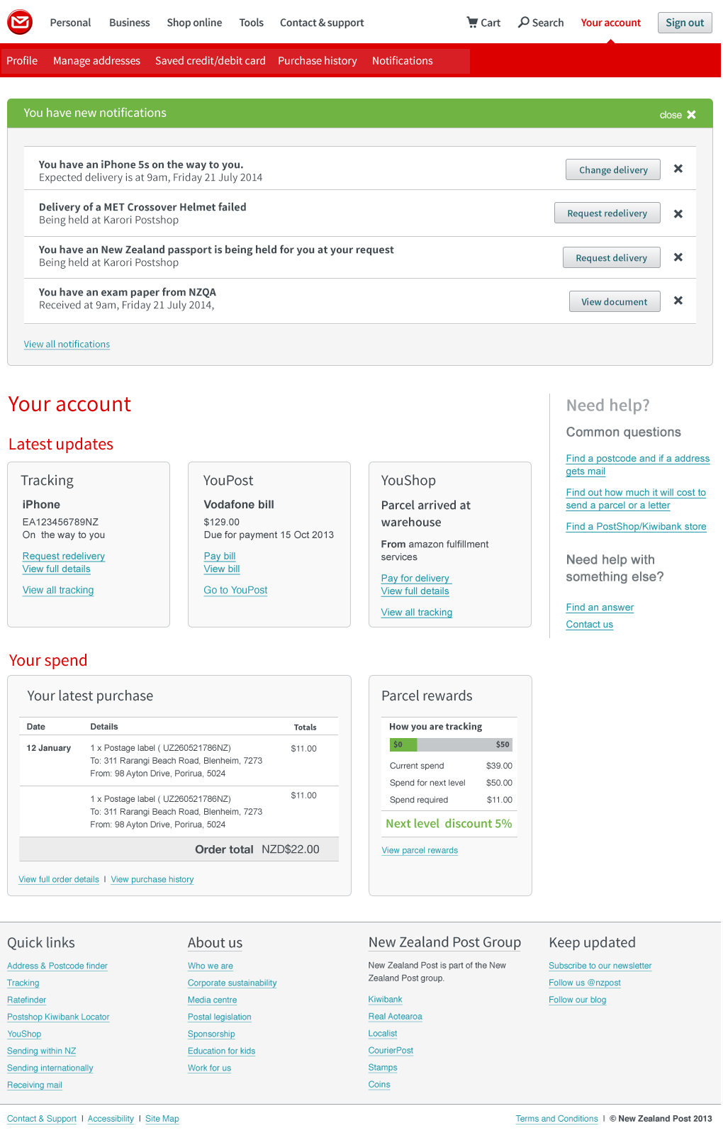
For the new page. Focus was giving an overview of all the online services needed to be available to the users on the homepage, while still allowing the business to promote other products/services and marketing campaigns.
Going live and looking to the future
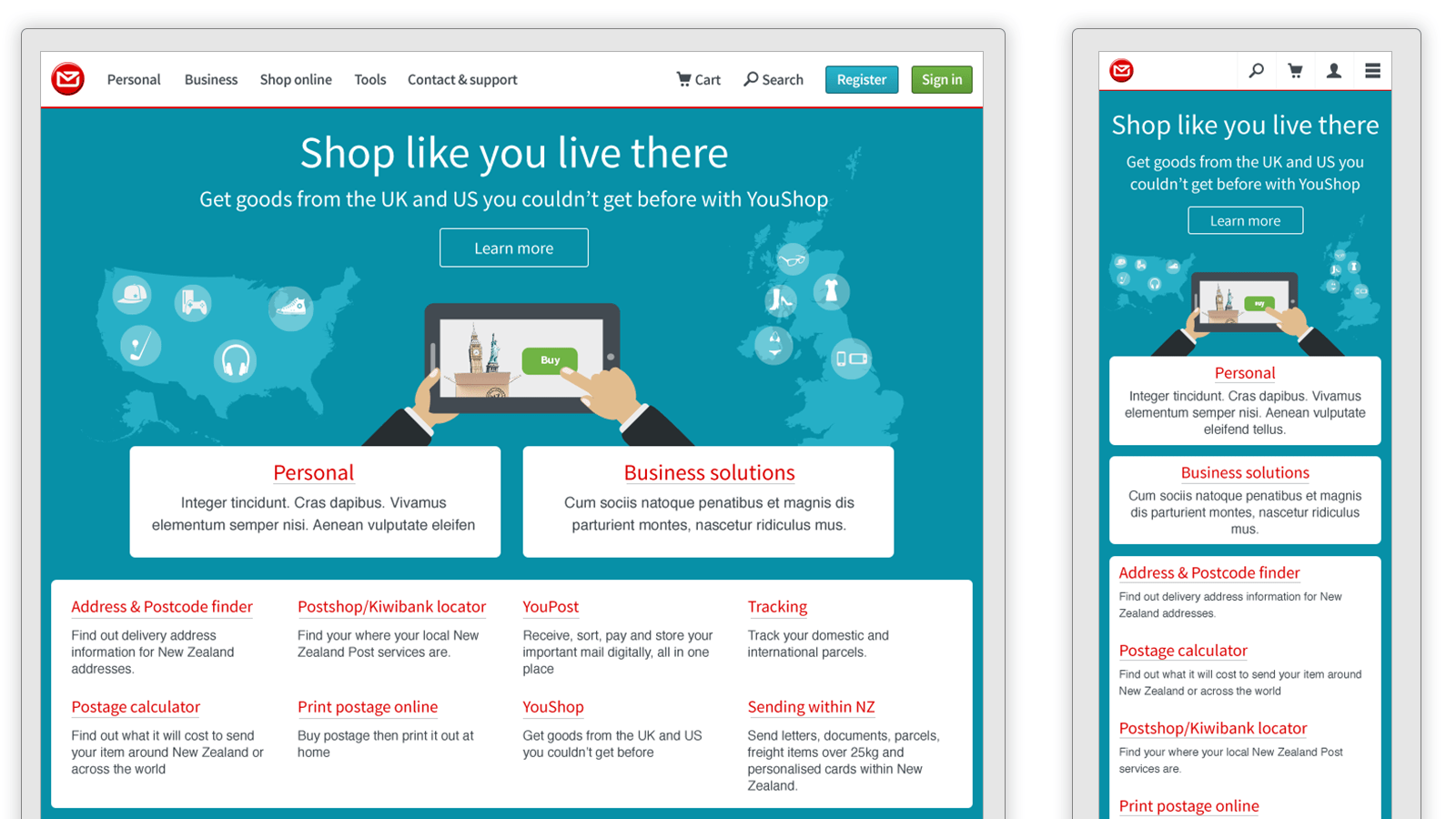
With homepage done and a pattern library in place. The online team where now easily able to update pages across the site. Focus could be placed on content and how our customers would interact with the site rather than UI but still allowing the site to evolve without a massive overhaul.
- Domain management platform
- Enterprise project management app
- nzpost.co.nz responsive redesign
- Address and Postcode finder
- YouShop marketing and application
- iPhone and Android apps
- Serenity Accounts website
- Serenity Accounts branding
- Geo Caching Game
- Diabetes Help Tauranga website
- Bay of Plenty Film website
- The Coffee Guide Book design
- Art of Tech exhibition
- NZSecretSanta
- Tanna Te Puke Annual Report
- Leak doctor branding
- Logos