The first iteration of YouShop was quickly designed to fit within the nzpost.co.nz website and the online team knew it could be improved upon. With a new consolidation feature being added we felt it was a good time to review and improve the customer experience.
YouShop marketing and application New Zealand Post
Making it easy to get goods delivered to New Zealand.
Ideation
The UX team began by researching with customers and looking into data to fully understand any issues. I went through all the data we had customer support, google analytics and uservoice feedback.
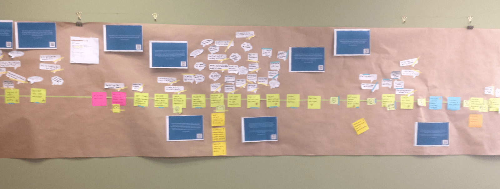
The UX team presented all the reseach back to the team and then I ran codesign sessions were the entire team (developers, designers, business owners ) to generate lots of ideas on how to solve YouShops problems.
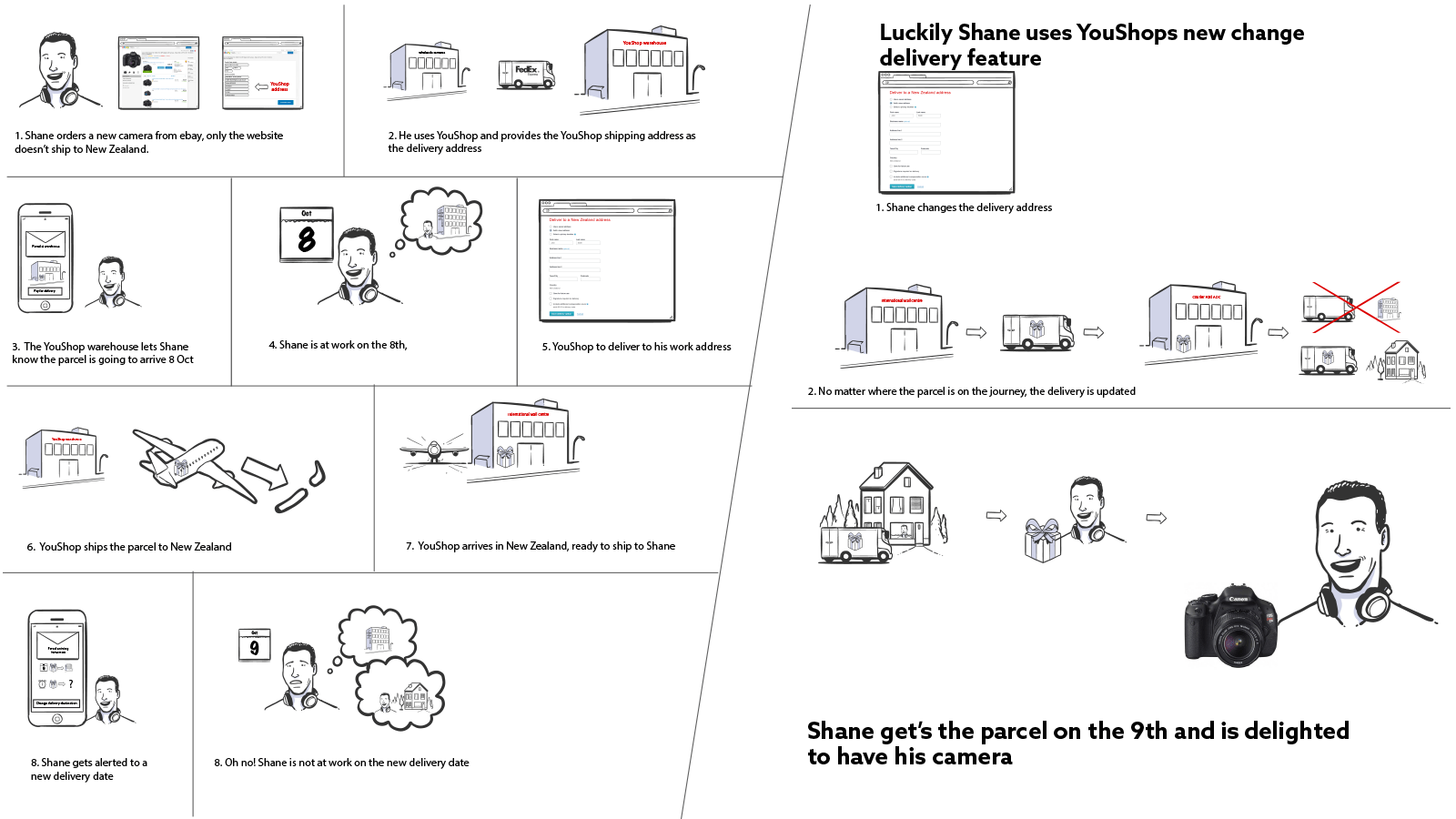
I also created an storyboard to help remind people of the full process from offline to online and show where the pain points where in the customer journey.
Refine wireframes
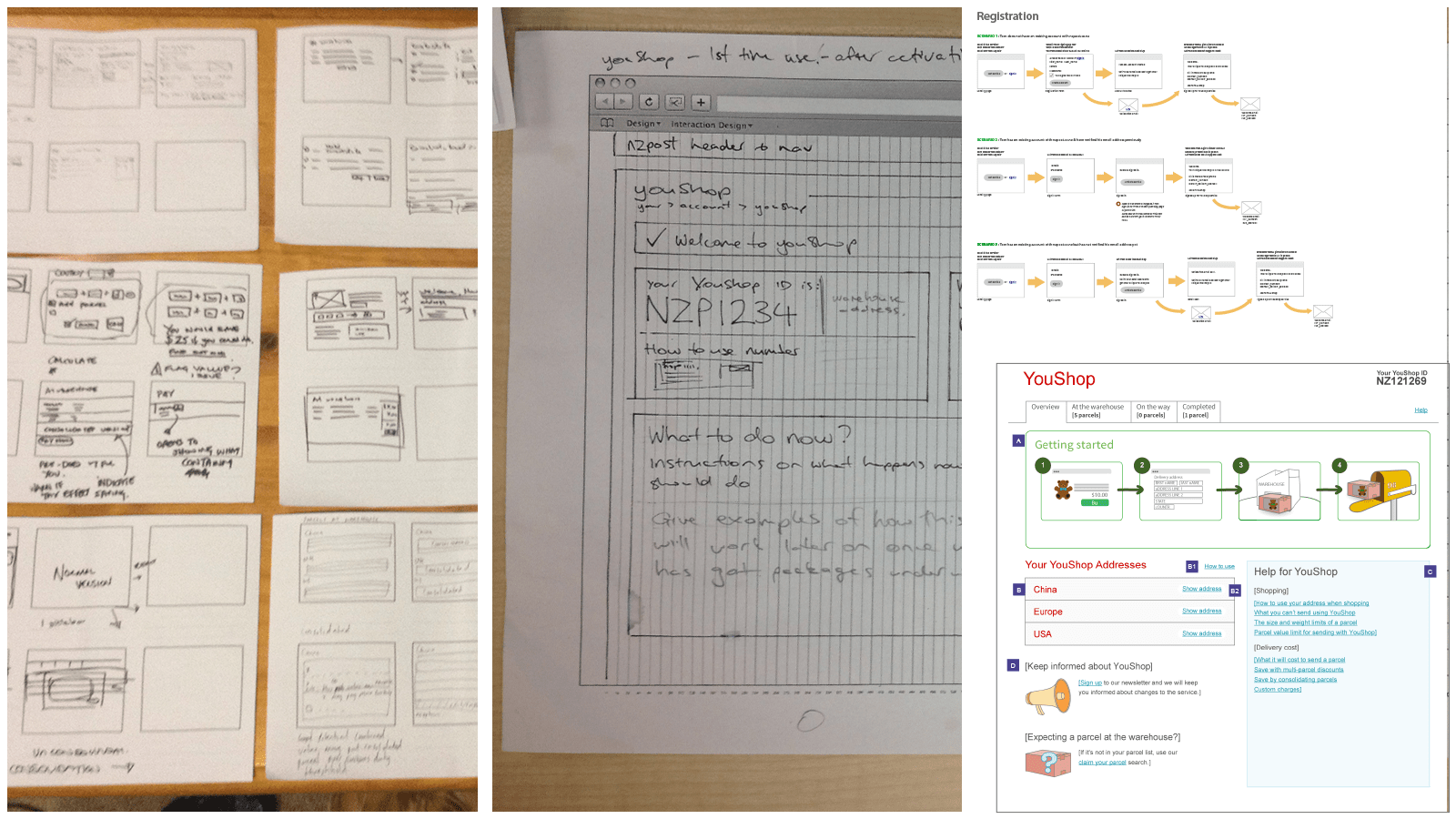
I started off the wireframing by using 8 ups to generate a lot of concepts with. By involving the wider team in this process we were able to generate a lot of ideas by also get the team aligned.
These concepts were refined these concepts down to a three versions which where tested and refined until we had a version of the application we where confident would meet our user needs.
Visual design
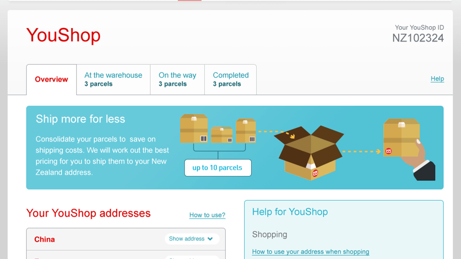
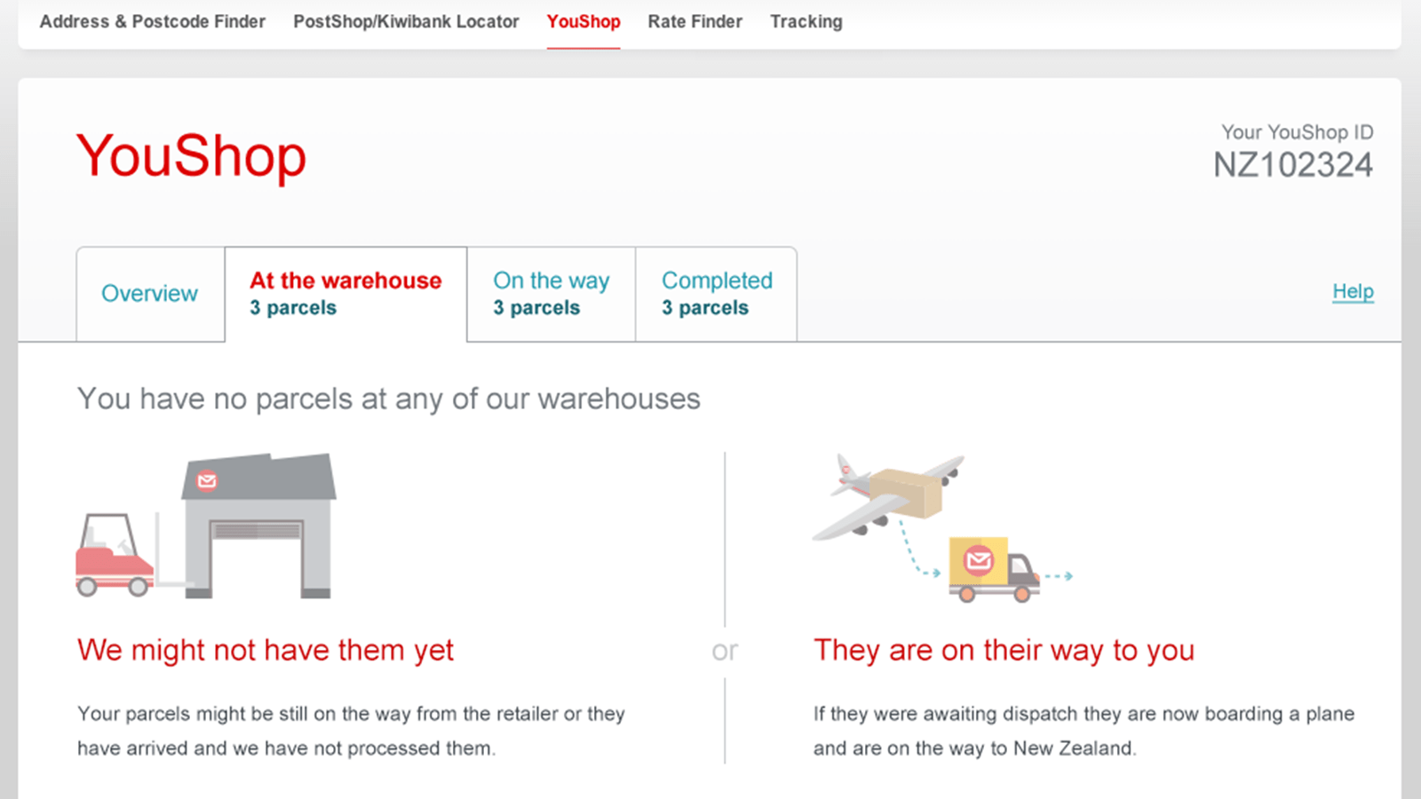
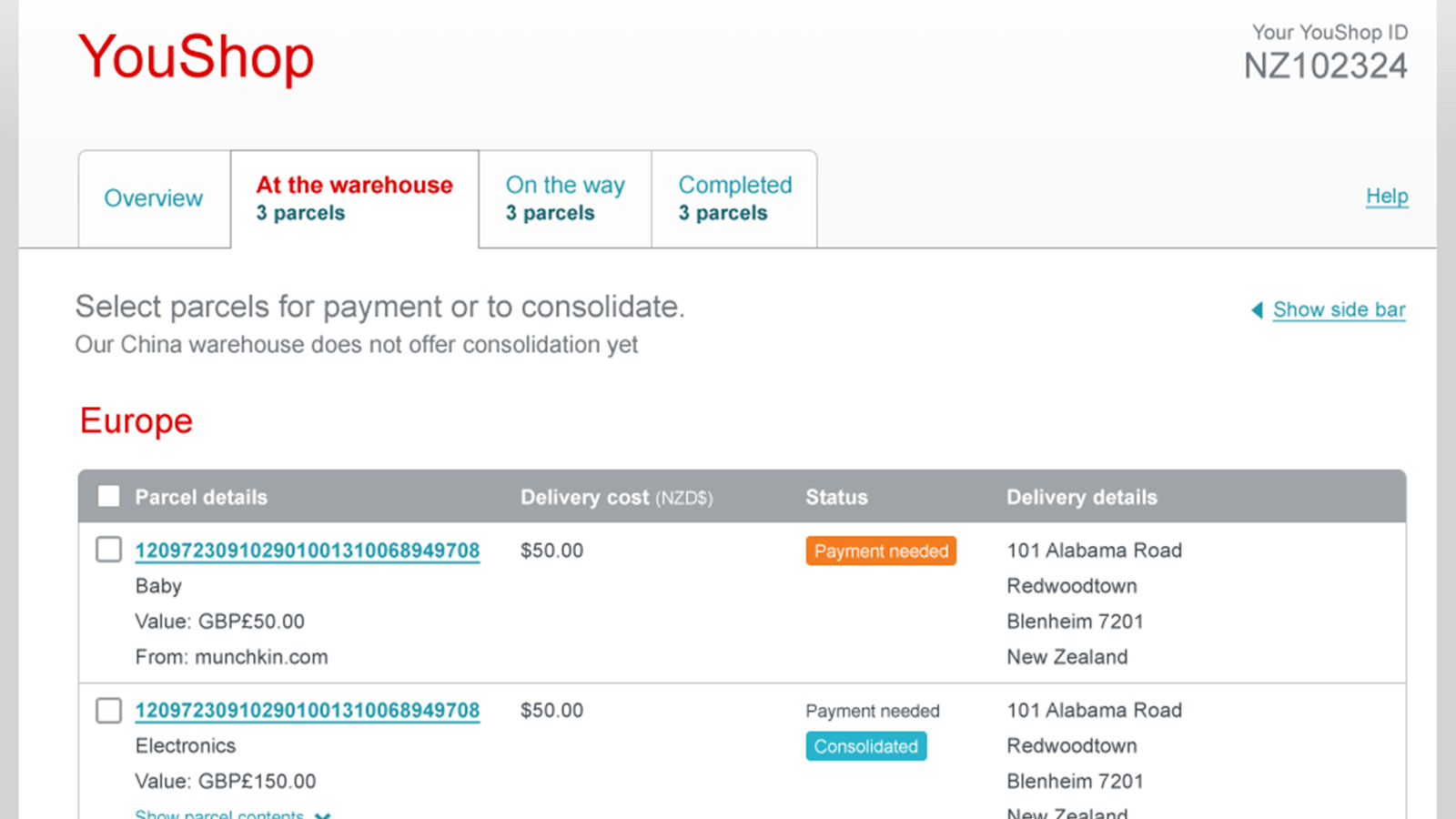
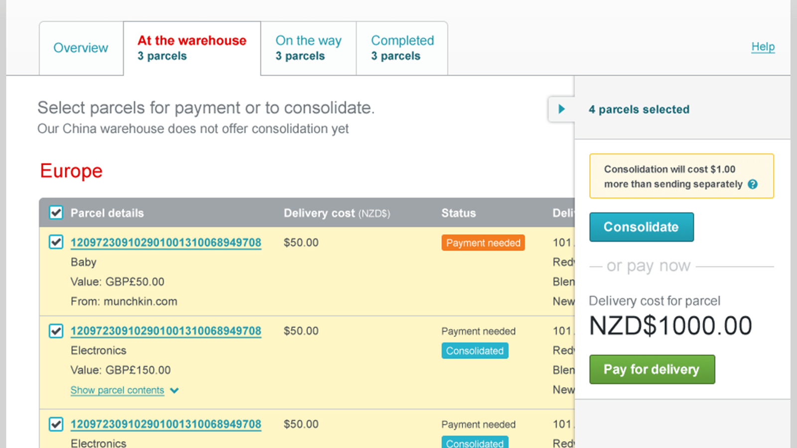
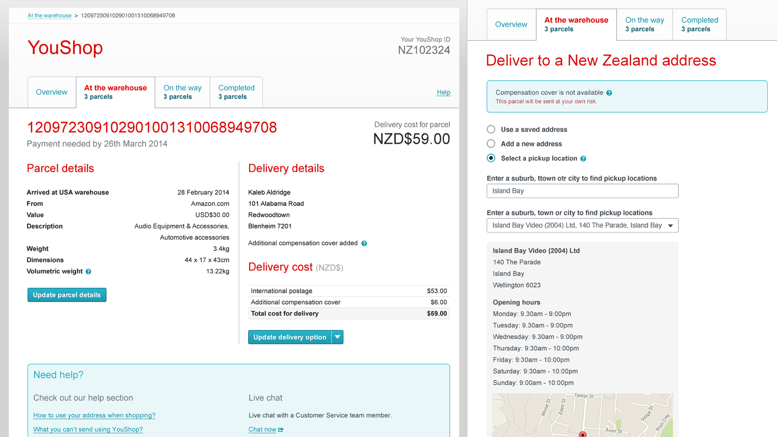
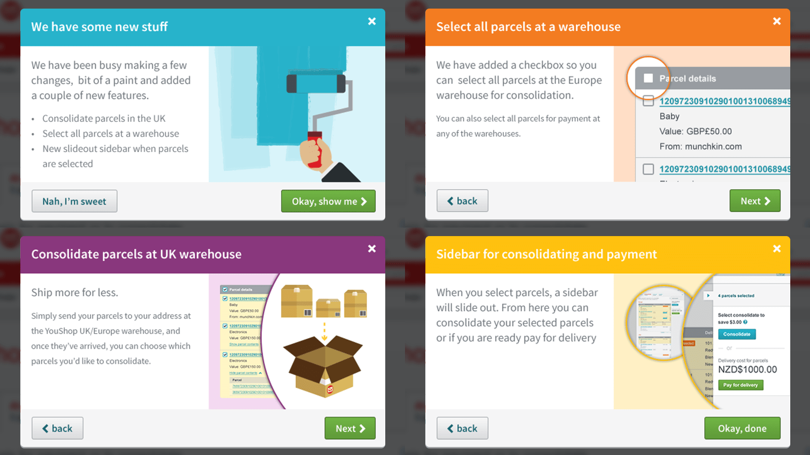
Using the new pattern library I was quickly able to apply the UI design. New illustrations and bright colours were used in add some life the application.
- Domain management platform
- Enterprise project management app
- nzpost.co.nz responsive redesign
- Address and Postcode finder
- YouShop marketing and application
- iPhone and Android apps
- Serenity Accounts website
- Serenity Accounts branding
- Geo Caching Game
- Diabetes Help Tauranga website
- Bay of Plenty Film website
- The Coffee Guide Book design
- Art of Tech exhibition
- NZSecretSanta
- Tanna Te Puke Annual Report
- Leak doctor branding
- Logos